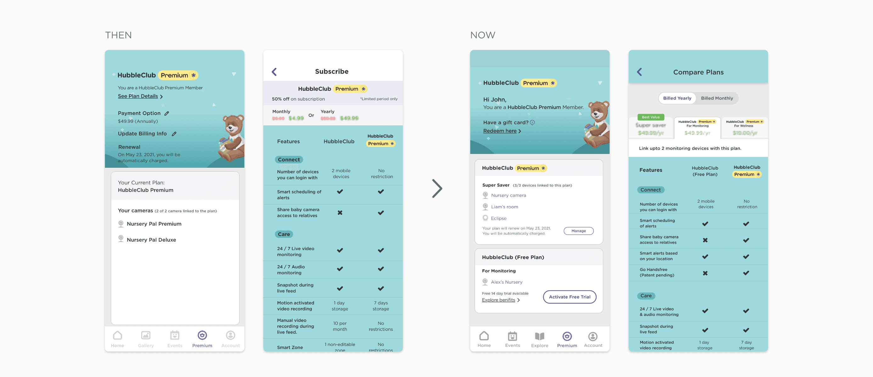
Designed a new experience for plans and pricing page for new subscription plans with a provision to accommodate future categories of premium products.
Hubble Connected • 2022 - 2023 • Feature Upgrade

About Hubble Connected
Hubble Connected is an end-to-end baby tech and smart living platform that uses technology to empower parents and their families to enjoy parenthood while staying connected. The HubbleClub app strives to provide a seamless experience for parents to track their baby’s growth & development, and sleep insights and provide engaging content for parents all the way from pregnancy through the toddler stage.
Project Goal
The company offers a premium subscription option to its users for monitoring devices which unlocks advanced monitoring features. A new line of wellness products is to be launched soon which also has premium offerings. This resulted in the need of reimagining the architecture of the current plans and pricing comparison information available in the app. This new experience also had to be designed for scale to accommodate a couple of future categories of premium products.
My Role
I owned, designed, and shipped the new experience highlighting plans and pricing comparison, upgrade options for free users, and gift card redemption flows for the HubbleClub app. In this project, I partnered with the product manager and content designer to redefine the user experience for these key flows. I worked closely with the engineering throughout the process to ensure technical feasibility and smooth implementation. The features are now developed and will soon be launched to users worldwide.
Key Design Challanges
An experience audit of the current user flows helped us identify gaps in the user experience. The pages needed a better structure for users to get a clear understanding of the offerings and manage their ongoing plans.
Here are a few of the key design challenges that we solved:
1. Designing for Scale
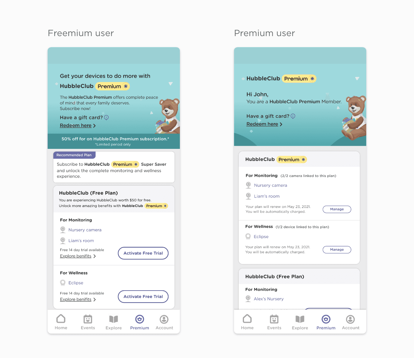
The current plans page needed to be designed for scale to accommodate upcoming premium plans for various categories of products. We wanted to ensure the redesigned page displays relevant information to the users based on their current plan.
Freemium members:
Help users pick the best plan: Based on the devices they have, recommend the best plan for their needs.
Provide upgrade option: A clear CTA button to encourage new users to opt-in for a 14-Day free trial.
Premium members:
Offer plan summary: Display their current plan details of one/multiple categories along with the linked devices.
Provide manage option: Clear entry point to manage the plan billing cycle and linked devices.
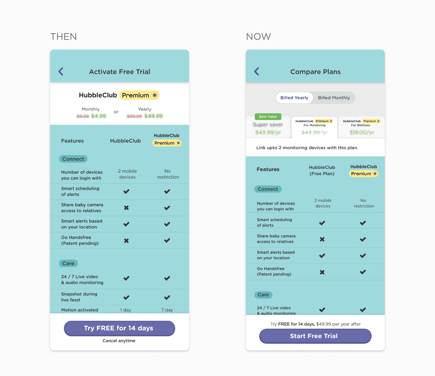
2. Reimagine plan comparison screens
The plan comparison page needed to be designed to accommodate the new plans with a way to compare with their respective free plan.
Research told us that users wanted to know the plan cost upfront so we made it visible all time. This helped users compare the prices easily while picking a plan.
Another user pain point was comparing prices between monthly/yearly billing options. We added a toggle button to switch between yearly and monthly billing options for a smoother experience.
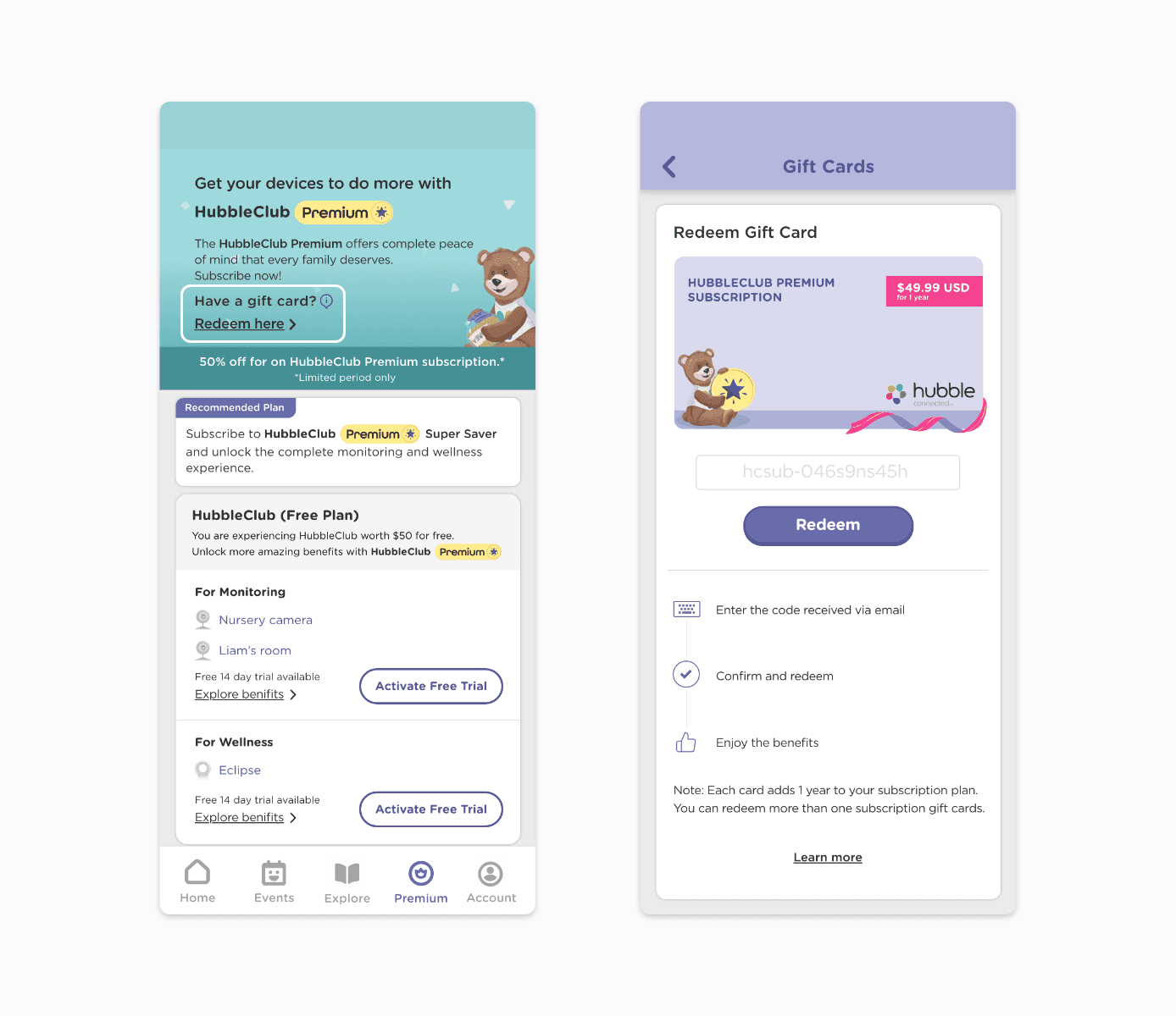
3. Redeem gift card feature
This was a new feature added to the plans page. Now, users could gift premium membership as a gift to their loved ones who owned Hubble products. Research insights helped me decide on the placement of the gift card redemption user flow.
4. Display promotional offers
Additionally, we also wanted to showcase limited time/seasonal offers that could be plugged in and out of the page. We added a banner below the gift card flow.
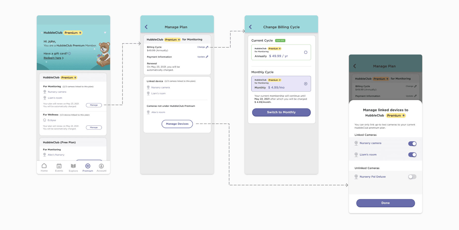
5. Managing plan got simpler
Prior to this redesign, the manage plan controls were fragmented and did not seem intuitive for users. Combining linked device information with the manage plan CTA in one place, helped users have a consolidated plan view and seamless user experience. Now all the controls such as editing payment details, managing billing cycles, and editing linked devices is accessible from one place.
Impact & Learning
The new plans page now can accommodate any future addition to the premium offerings without having to change the information architecture and user experience.
This project gave me an opportunity to standardize design patterns for the common information groups. The information is now organised in a modular fashion that can be plugged in and out depending on the ever-changing company offerings and user context.
This project was particularly challenging from simplifying the information design point of view. I worked closely with the content designer and project manager to create a shared user understanding that helped us deliver the new, more intuitive plans experience.
Back to top


